Surprise, the operator is preparing a completely new account management application intended for Freebox subscribers. It’s currently an Alpha version, and it’s still incomplete, but we’re giving you an overview of what it has to offer at the moment.
If you feel like a tester, you can discover the My Free Account mobile app with a test program. To access Alpha, you will need to use test trip for iOS and registration via dedicated software for android smartphones with your email address. However, it should be noted that you can receive an alert from your smartphone by downloading it to the Google operating system because the application does not come from the play store.
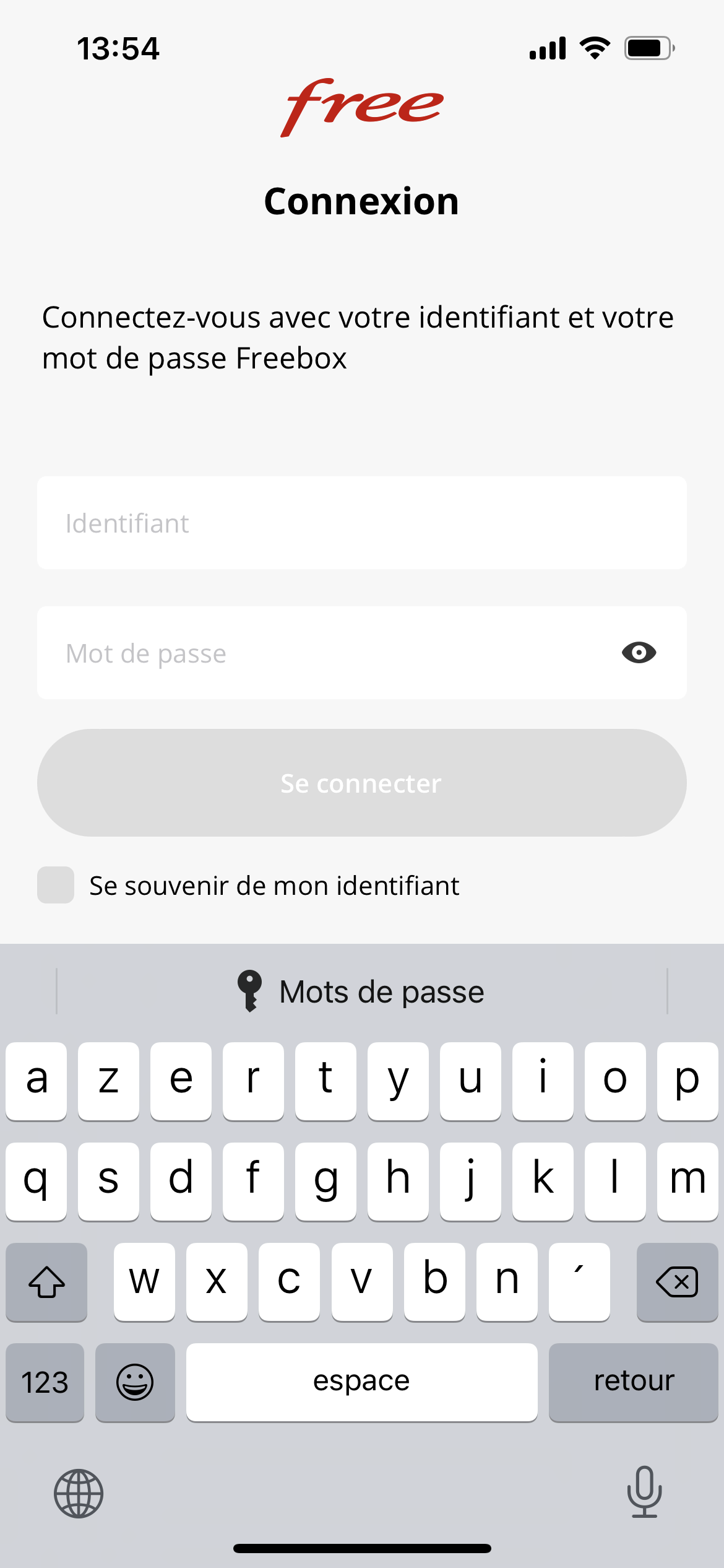
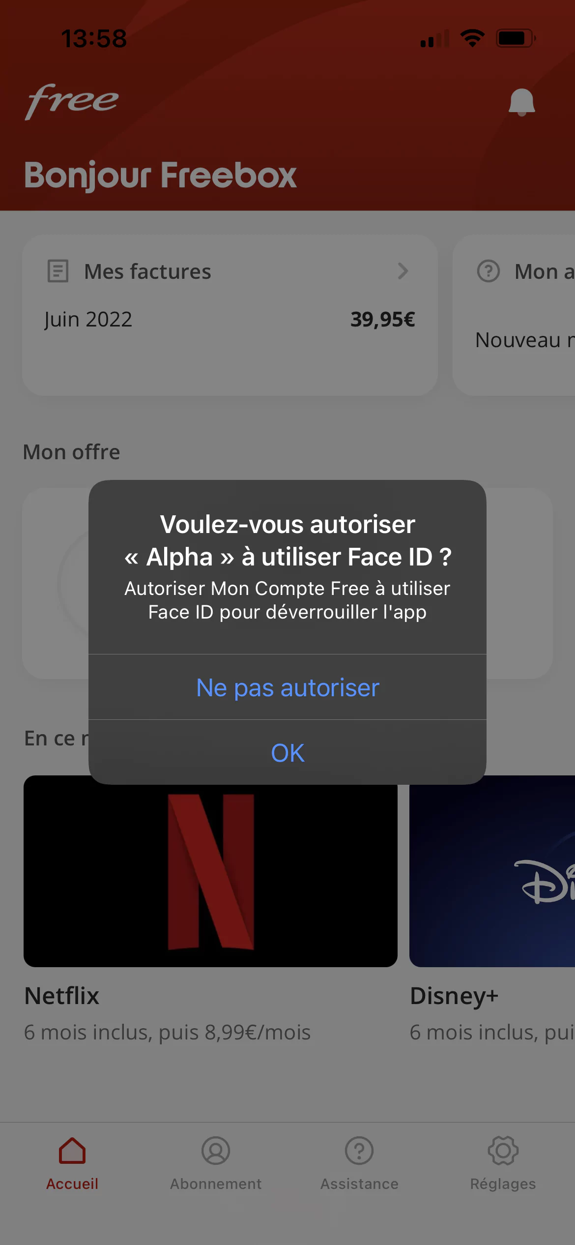
The purpose of this application is simply to provide a solution for subscribers space and account management compatible with smartphones. It is currently reserved for Freebox subscribers and, for the first connection, you will need to use your personal IDs to connect to it. Note however, once you make that first identification, you are offered to use Face ID on the iPhone to unlock the app. This possibility was not introduced during our Android testing. However, you can save your username to avoid having to enter it every time you open it.
You have now reached the home page of the application. The first difference noted between the two operating systems is that on Android, dark mode is available when you adjust system settings on this display while on iOS this is not the case. For the presentation, in order you will find a line with a button that gives you access to your bills and another for help, a line dedicated to your presentation and a line dedicated to current offers. The latter is not currently usable.
On Android, on the first line you will also find a listing dedicated to TV options that are not accessible at the moment. Viewing bills is similar to what can be found in the subscribers area of Freebox, with the required file open, however it cannot be downloaded to your phone yet.
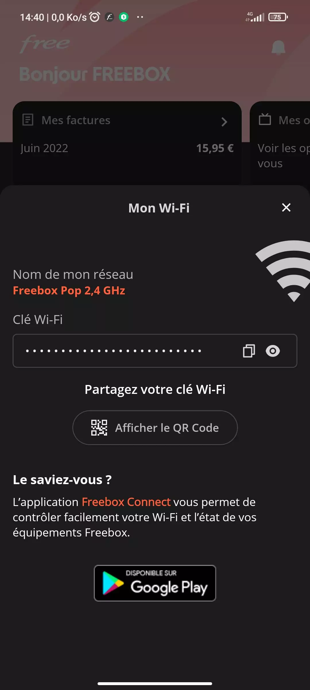
By clicking on your view, you have two options: view a summary of your subscription or edit your WiFi. This last option was only available, during testing, on the Android version and then offers you to select the network of your choice (depending on the frequency band used). You can then find your WiFi key, display a QR code to share it more easily, and then of course the Xavier Niel player invites you to use the dedicated Freebox Connect app for these features.
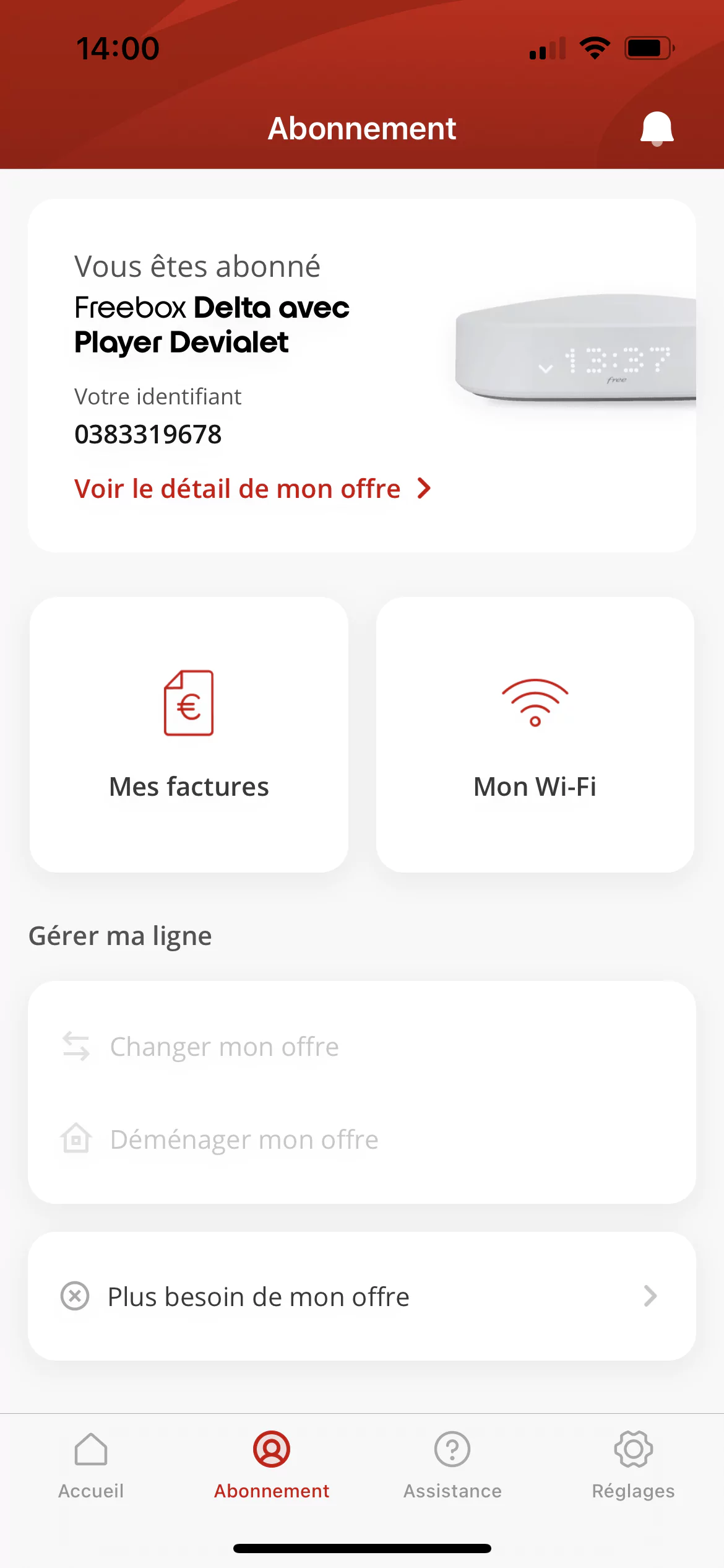
Billing and WiFi management are also in the “Subscription” section, and can be accessed from the banner at the bottom of the screen. The latter will especially allow you to manage your streak, even if it is somewhat empty at the moment. In fact, the lines called “accidental change” and “accidental transfer” are currently unavailable. The only functionality that you can activate only on this page is the information function regarding a possible termination. By clicking on it, the operator tells you the steps to follow and the consequences of termination.
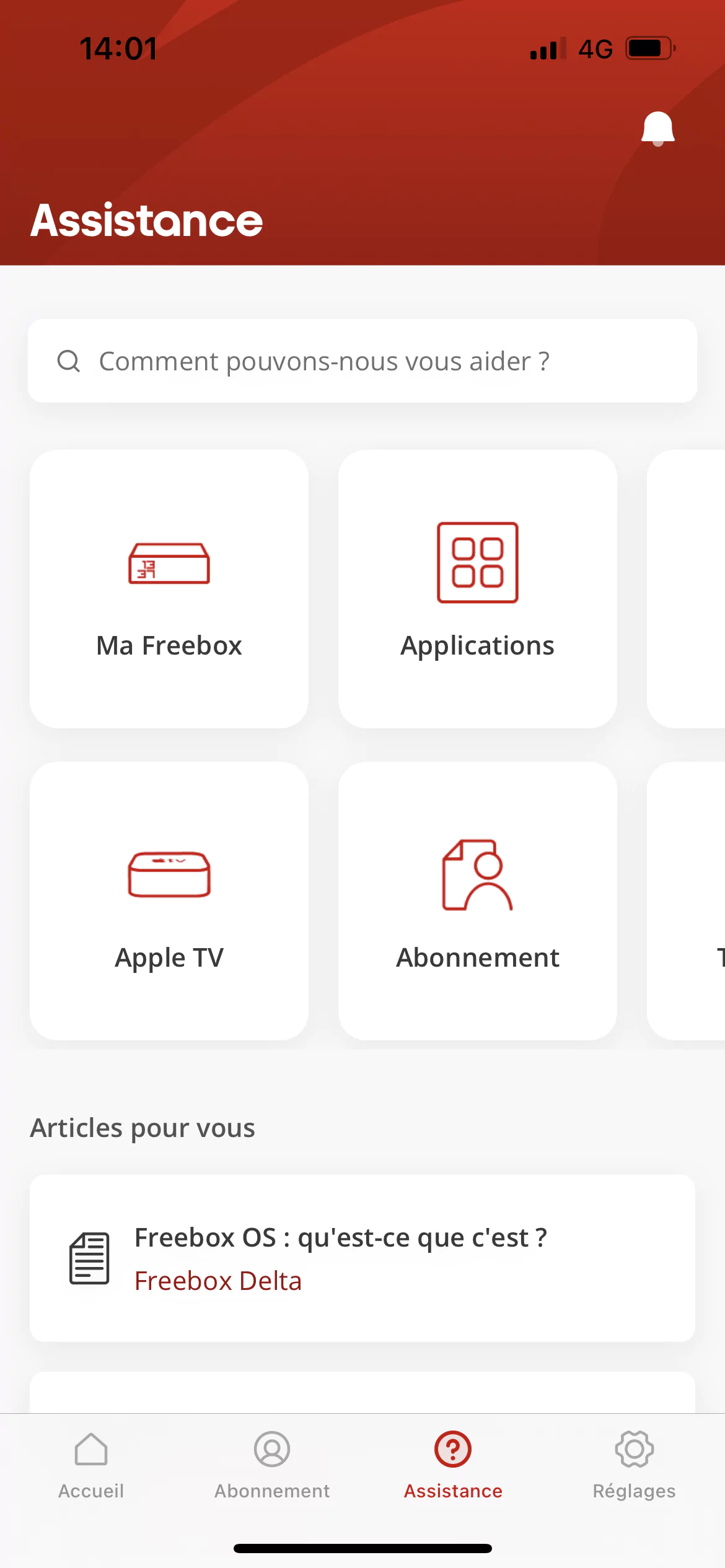
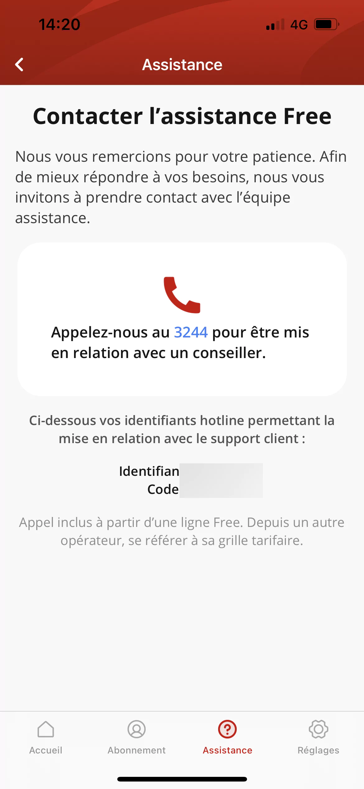
Then comes an important section: help. But here, nothing innovative, you will be able to access all the topics already on the site and the free help application, either by text search or by navigating several topics. Note that there is also integrated access to help directly with an incentive to call 3244 in case of a problem and your Hotline IDs.
The operator will also introduce a notification system, without really indicating what it will send to the subscriber since the function is not yet active. This is also the case for the last section of the app dedicated to Settings, where we are invited to come back later because the functionality is still under development.
In the face of an Alpha version still in development, it’s hard to make a clear verdict, but the app seems to be heading in the right direction. The user experience is fairly smooth and you quickly know where to go to get the information you want, provided it is available. Anyway, if it can’t replace the subscribers space due to lack of functionality, we can hope that with feedback from users who can post comments and feedback by shaking their screen or taking a screenshot, it improves dramatically over time. Waiting for the final product.

“Devoted gamer. Webaholic. Infuriatingly humble social media trailblazer. Lifelong internet expert.”


