Tool: a hyperbolic object that takes pride in an inheritance of a certain significance (fetish) and which excludes or eludes use value (“unwanted”), but produces strong or weak forms of affection (feeling) or pleasure. Sometimes it can’t be done without (enjoying). In any case, group merchandise as a relevant ‘gift’, when it is not a commodity in and of itself. In this case, an absolute complement, carrying an ambiguous share of surplus value or excess enjoyment. Of uncertain institutional and official status (art? design? simple fun?) passes under any form of classification. These types of things seem to be multiplying today, and they can be found in very different sizes, from the minimalist IKEA dollhouse to the extreme of a museum.
Here is an example.
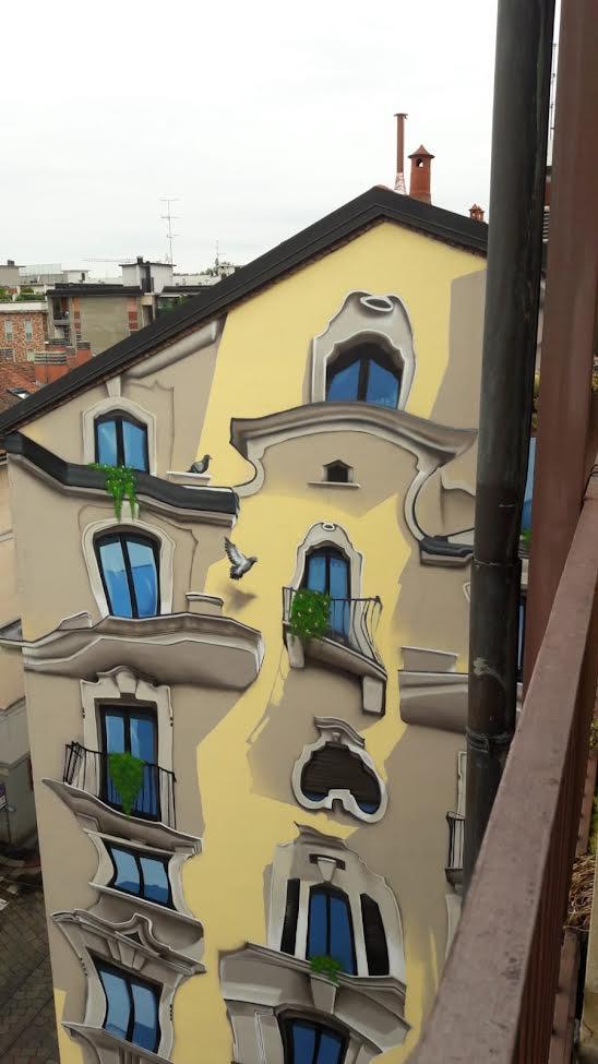
There is a frontage of a house on Corso di Porta Romana in Milan. An old house is painted pale yellow, with a vague Baroque flair: at the top, a dormer window with a tympanum and a carved frame window features a curious perforated frieze. Below, a clover-shaped window, also decorated, and then a small dark opening, a kind of bathroom. On both sides of the central part, rows of windows and other balconies, in turn, are decorated with bas-reliefs. The whole has an aristocratic appearance, almost like an old country villa forgotten and trapped by city traffic, in short, out of place (even if it is a condominium, perhaps from the early 20th century).
Now, if I turn the corner, on the blind wall of the right side, its clone, or rather its non-conforming version, appears, repeating in a kind of optical illusion Which goes from the dormer to the ground floor. The prominent volumes and heavy eaves of the windows are emphasized. Everything is strangely different though recognizable. As we saw through those distorting mirrors that were found in the theme parks. Or perhaps as in the scales of Mickey’s comics: volumes become rubbery, creamy, soft, hardness that seems close to melting. Balcony balustrades turn into threads of licorice, the spurs of window sills and balconies cascade down, everything indicating a transitional state between solid and liquid, the transition from the firmness of stone or concrete to the smoothness of cake in an uneasy equilibrium on their surface. private cluster. You would even expect instability to be emphasized by those short curved strokes that reproduce the vibrations of objects or figures, as in Keith Haring’s forms: ((…)). A dove flies from the windowsill to the nearby balcony casting a shadow on the wall, stopping with a Dutch detail.
What is this? A mural of the city offered the public, as an inscription below it says (“Advertisement of the City”), an unexpected gift for passersby looking to stop for a photo shoot with their cell phones. A flashy gift that stands out in the context of street indifference. They say he looks like Gaudi. Topological deformation, expansion and expansion are already remembered stone Or better to the front of Casa Batllo. In fact, it seems to me a bit like the homes of Mickey Mouse or Dockburg, or Uncle Scrooge’s Cube Deposit, bloated and about to explode from the surplus dollars they contain. Or to the Ligurian houses of the last animated movie Lucaor to the former streets of Paris ratatouille.
But if we take the distortion of fonts and volumes to an extreme, we go beyond the limits of recognition. As in the Guggenheim in Bilbao or in the newer building of the Vuitton Foundation in Paris: no more lines but balls or plates covered in puff pastry. The format, which is starting to lose its stability in Barcelona, ends up in a chaotic tangle in Bilbao or Paris. Or better yet, the dance house From Prague, also by Gehry: A kind of cardboard tube folded in the middle seems to be reeling, almost falling back on itself.
Compared to this series, where volumes and shapes move and seem to have a life of their own, to these buildings from Cartoonia, optical illusion Milanese represents a kind of 2D intermediate state, almost a cynical anti-project that does nothing but exacerbate an implicit expectation or invitation that is already visible in the nearby 3D interface.
Gaudì, o Disney: Disney. Examples of a method, for pictorial code, such as an emulator, he claims to represent or analogy, but in fact its examples are multiplied in an infinite horizontal call (Once). As the “original” facade of the Porta Romana is, on its own, a quotation of an earlier phase that can be vaguely identified, perhaps, with the Baroque, it has been said. a drawing-a tool little architecture-a tool, the second and third dimensions follow each other and form pairs without originality.
but why a tool? the a tool A bogus gift, it simulates a service, a free offer, and a use value for its own good, offering innocuous pleasure where innovation is indistinguishable from impromptu discovery. It is no coincidence that optical illusion di Porta Romana is a refined marketing operation, as evidenced by the client company’s logo, located discreetly on the red curtains on the mezzanine windows.
If we continue to keep this space alive, thank you. Even one euro means a lot to us. READ AGAIN SOON AND SUPPORT DOPPIOZERO

NS. Orsenego.

“Web fanatic. Travel scholar. Certified music evangelist. Coffee expert. Unapologetic internet guru. Beer nerd.”


