For some time now, Google has been testing a new interface for the YouTube mobile app.
Here's what we know
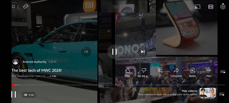
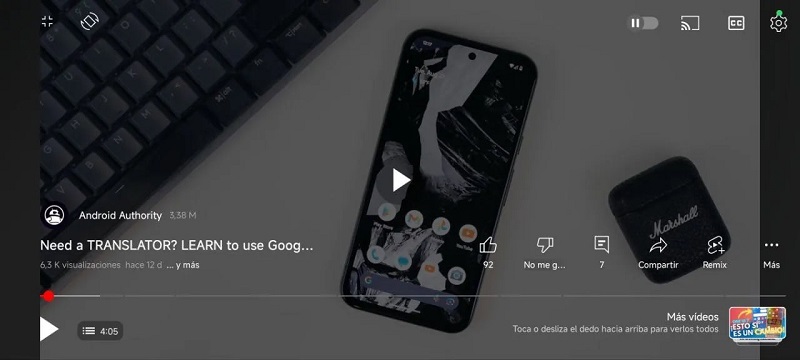
Users noticed that a few months ago, some people changed the YouTube interface on Android and iOS. The biggest changes occurred in full-screen display mode. The developer has changed the location of the active buttons, so that they now appear at the bottom, in addition to icons for “Pause”, “Timeline”, “Like”, “Dislike”, “Add to playlist”, “Share” and others. Buttons.

Meanwhile, the video name and playlist are no longer located at the top of the screen, but at the bottom. In addition, the view count and video post date are now displayed in full screen mode, and the left-to-right arrows are only visible in portrait mode.

In addition, it is now possible to switch between videos in a playlist using a single slide:
The majority of active YouTubers welcomed the innovations without much enthusiasm and believe that there is no need to change the already good interface of the video host.
It's not yet clear when Google will launch the new interface on all mobile devices, but it shouldn't take long.
source: Robot body


